Field types
Every question in the builder has a label, a database field name (auto-derived from the label, editable via the ⋯ menu), an optional placeholder, and a Required toggle. Pick a type from the type dropdown on each question card:
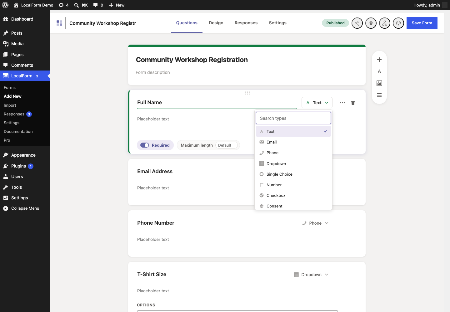
Input fields
| Type | Stored value | Notes |
|---|---|---|
| Text | string | Default free-text input. |
| string | Validated server-side (is_email). Also the target for confirmation emails. | |
| Phone | string | Accepts +, digits, spaces, dashes, dots, parentheses; 7–25 characters. |
| Dropdown | string | One choice from the configured options. Submitted values are validated against the options. |
| Single Choice | string | Radio buttons. One choice, validated against the options. |
| Number | number | Numeric input. |
| Checkbox | array of strings | Multi-select. Each configured option renders its own checkbox; any subset can be picked. |
| Consent | yes or empty | A single tick box for a statement the visitor agrees to - terms of service, a privacy policy, a newsletter opt-in. Instead of options it takes a statement (sanitized with wp_kses_post, so links are allowed); the statement itself is the label next to the box. Stored as yes when ticked and empty when not, whatever the browser sent. |
| Date | string (YYYY-MM-DD) | Native date picker; validated as a real calendar date. |
| Date Range | { start, end } (each YYYY-MM-DD) | Two native date pickers. "Require both start and end date" is configurable per field; when off, either date alone satisfies a required field. The end date must be on or after the start date. |
| Rating | number | A row of radio options from a configurable min to max (default 1–5), shown as numbers, stars, or as a Net Promoter Score. Validated against the configured range. |
| Likert Scale | { statement id: point } | A grid: several statements down the side, one shared scale across the top. Answers are stored as the point number (1 upwards) against the statement's own id. See Grid questions below. |
| Choice Grid | { statement id: option } | The same grid with your own columns instead of a scale: one choice per statement, stored as the option's own text. |
| Checkbox Grid | { statement id: [options] } | A choice grid that takes any number of answers per statement. |
| Ranking | { item id: place } | Put the items in order, one place each. Stored as the place number (1 is first). See Grid questions. |
| Points Allocation | { item id: amount } | Share a fixed total out across the items - a constant sum. An answer has to add up to the total exactly. |
| Slider | number | A track from a low value to a high one, with the value shown beside it. Optional wording at each end. |
| Textarea | string | Multi-line text. |
Maximum length
Short text, long text, email and phone questions each take an optional Maximum length, in characters. Leave it empty and the question uses the default for its type: 5000 characters for long text, 254 for email (the longest address there is), 25 for phone and 1000 for short text.
The limit is enforced when the submission arrives and applied to the field on screen, so somebody typing a long answer runs out of room rather than being told off after submitting. Set one where an answer has to be short - a reference code, a postcode - or raise it where an answer honestly needs more room than the default allows.
A required Consent field that has not been ticked reports "Please accept "<label>" to continue." instead of the generic "is required" message, and the Responses summary counts it as Accepted rather than charting a raw yes.
Net Promoter Score
Set a Rating question's style to Net Promoter Score and it becomes the standard "how likely are you to recommend us?" question: nought to ten, with both ends written out on the form. The range is fixed rather than configurable
- a score worked out on any other range is not comparable with anybody else's, which is the only reason to use this measure instead of an average.
The Responses Summary tab then reports the score rather than an average out of ten:
- Promoters answered 9 or 10.
- Passives answered 7 or 8. They count towards the total and towards neither share, which is what pulls a score down when most people are merely content.
- Detractors answered 6 or below.
The score is the share of promoters less the share of detractors, as a whole number between -100 and 100. The spread of individual answers is still charted underneath it, and both go into the summary sheet of an Excel export.
Nothing changes about what is stored: an NPS answer is the number the visitor picked, exactly as any other rating. Switching an existing 0-10 rating question to this style re-reports the answers you already have.
Grid questions
Five question types are grids: the same thing asked about several statements at once, with the answers written across the top and the statements down the side. They share their statements, their storage shape and their reporting; what differs is what the columns are.
The builder sets one up as the grid itself: the columns along the top and an answer under each of them on every statement, so the card shows the question a visitor will see rather than a list of settings describing it. A grid wider than the card scrolls sideways.
Likert Scale
A Likert Scale question asks the same thing about several statements at once - "the staff were helpful", "the room was clean" - on one shared scale. It is the shape a survey uses when a stack of separate rating questions would be unreadable.
It takes:
- Statements - one per row, up to twenty. This is what a visitor answers.
- Scale - a ready-made scale (Agreement, Frequency, Satisfaction, Importance or Likelihood) at 3, 4, 5 or 7 points, or Custom, which turns the column headings into boxes you type your own labels into, lowest first. It starts from the scale it replaces, and a column can be added or removed from the grid.
- Offer a "Not applicable" column - an extra column for statements a visitor cannot answer. It counts as answered and is left out of the averages, rather than scoring as the bottom of the scale.
- Require an answer to every statement - on by default. Switch it off and a required question is satisfied by any one statement, the way a date range can be satisfied by either date.
Choice Grid and Checkbox Grid
The same grid, with columns of your own instead of a scale. The columns are the question's options, edited in the same list a dropdown or checkbox question uses, so a grid is exactly "a choice question asked about several things at once" - and, like those types, it stores the option's own text as the answer.
A Choice Grid takes one answer per statement; a Checkbox Grid takes any number. Neither has an average, because their columns are choices rather than a scale: the Summary tab counts them instead.
Use one where the answers are not an ordered scale - "which sessions will you attend, on which days", "which of these apply to each site" - and a Likert where they are.
Ranking
Ranking asks for the items in order: as many places as there are items, and each place used once. It is stored as the place number, so 1 is first.
A half-finished ordering is accepted on a question that is not required, but a contradictory one never is - two items in the same place is not an ordering, and keeping one of them would record an answer nobody gave. The Summary tab reports the mean place each item was given, which is the number that actually orders the results, alongside how often it was put in each place.
Points Allocation
Points Allocation shares a fixed total out across the items - a constant sum. Set the Total to share out (100 by default) and, optionally, what it is counted in ("points", "%", "hours"), which is shown beside each box.
A running total sits under the question as it is filled in, and an answer has to add up to the total exactly. That rule is the question: "60 of 100 allocated" is not an answer to "how would you split this", so a partial allocation is refused rather than stored. An untouched question is still blank, and one that is not required may be left that way. The Summary tab reports the mean share each item was given.
On a phone
Every grid becomes one block per statement on a narrow screen, with the answer labels beside their buttons instead of across the top.
What gets stored
Answers are stored against each statement's own id. A Likert stores the point number; a grid stores the option's text:
{ "service":   { "row_a1b2": 4, "row_c3d4": "na" } }
{ "attending": { "row_a1b2": "Morning", "row_c3d4": "Afternoon" } }
{ "topics":    { "row_a1b2": ["Email", "Phone"] } }
Two consequences worth knowing:
- Rewording a statement keeps its answers. They are attached to the id, not to the wording.
- A Likert's scale labels are read fresh every time. Rewording the scale re-labels the answers already collected, exactly as correcting a quiz answer key re-marks the responses already collected. Changing how many points the scale has does not move the answers already on it - a stored 4 that read "Agree" on a five-point scale reads "Somewhat agree" on a seven-point one, so change the width of a scale that has already collected answers only if you mean to.
In responses and exports
The Responses Summary tab reports a grid as a grid: a row per statement and a column per answer. A Likert adds the mean score for each statement alongside the mean across the whole question; a choice grid has no mean to add.
In a CSV or XLSX export the question spreads across one column per
statement, headed <question> - <statement>, holding the answer that was
chosen. That is one variable per column, which is what a spreadsheet or a stats
package expects; every other question type is still a single column. Emails,
the submissions table and printed responses show the whole grid on one line as
Statement: answer; Statement: answer.
Slider
A Slider is a number with a track drawn round it: a low value, a high value, a step, and optional wording at each end ("Not at all", "Completely"). The value the handle is on is printed beside it as it moves.
Nothing about it is stored differently from a Number question - it is the number the visitor chose - so it is reported as one, with the lowest, average and highest across all responses. Use it where the answer is a point on a continuum and typing a figure would be a false precision; use Number where somebody genuinely knows the figure.
:::caution A slider always submits a value
A slider's handle starts in the middle of its track, and a browser submits whatever it is on whether or not anyone touched it. So a slider cannot tell "chose the middle" from "did not answer", and marking one Required adds nothing - the value is always there.
Where that distinction matters - where "no opinion" is a real answer you need to count - ask it as a Number question, a Rating, or a Single Choice with a "no opinion" option, all of which are genuinely blank until somebody answers. :::
Static blocks
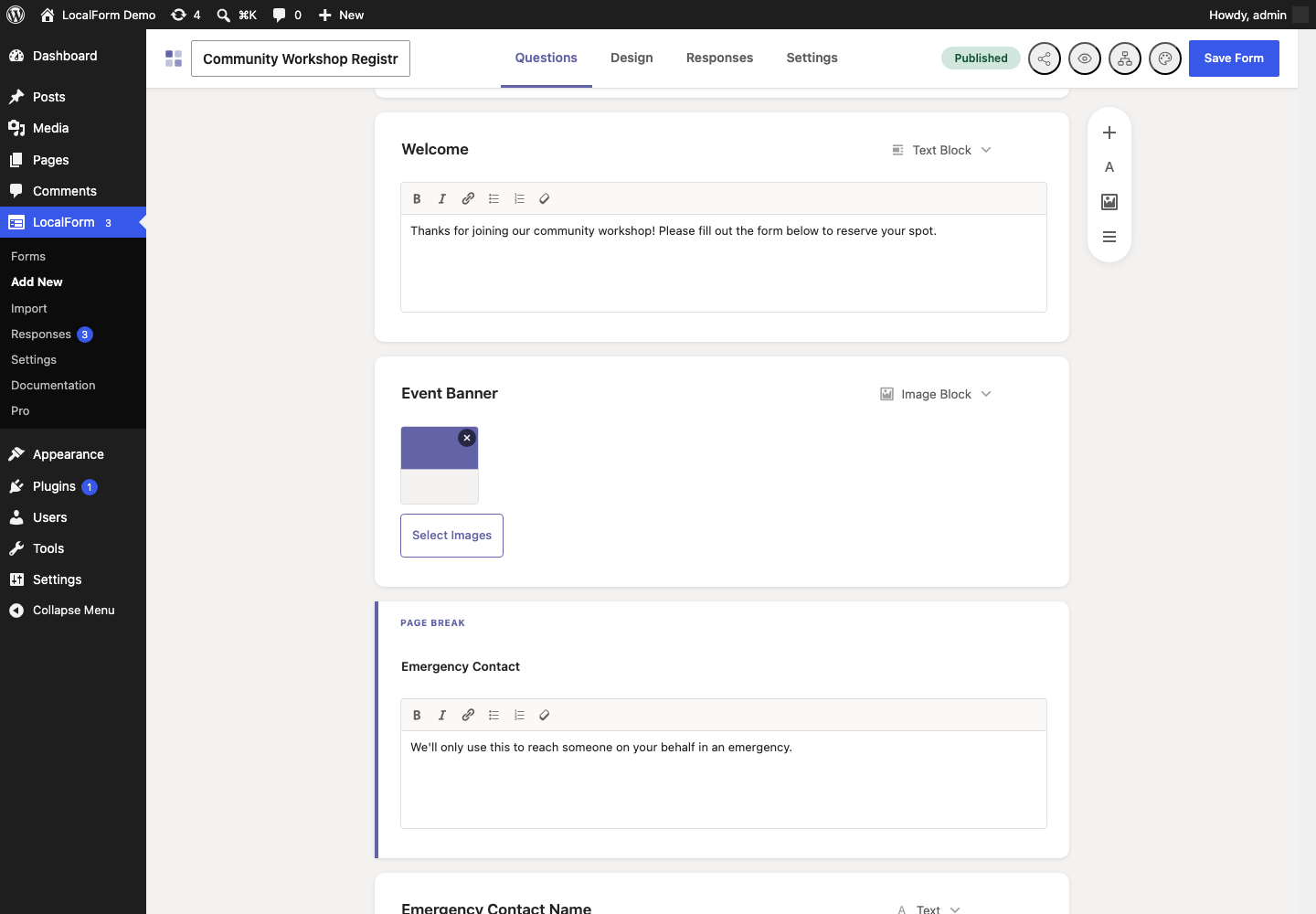
Static blocks display content but never collect or store data. They are excluded from submissions, exports, webhook payloads, and emails.
-
Text Block - a heading plus rich text, written with a formatting toolbar (bold, italic, links, lists) and sanitized with
wp_kses_post. -
Image Block - one or more images from the media library; multiple images render as a gallery.
-
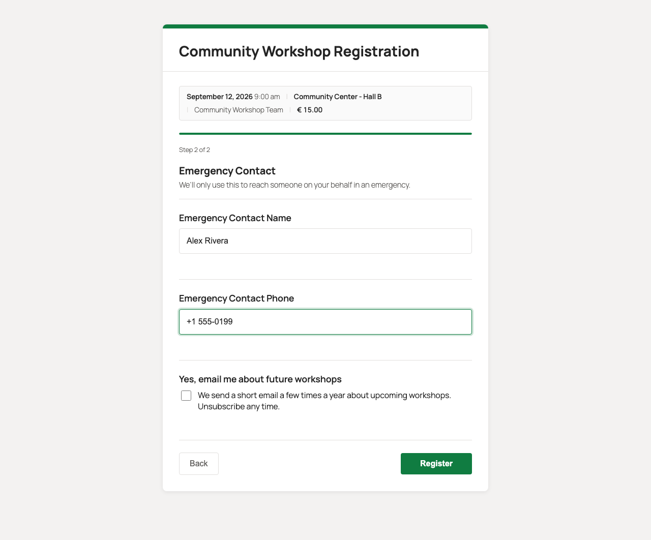
Section - a heading plus description (same formatting toolbar as a Text Block) that also splits the form into a new step. Everything from a Section onward (until the next Section, or the end of the form) becomes its own page, with a progress bar and Back/Next navigation on the frontend.
Options editor
Dropdown, Single Choice, Checkbox, Choice Grid and Checkbox Grid fields share the same options editor: add one option per row. The option text is both the label shown to visitors and the stored value - on a grid it is the wording of a column.