Design, tags & anti-spam
A few more per-form and site-wide options beyond registration limits, emails, and webhooks.
Design
The Design tab, next to Questions, holds everything about how a form looks: show or hide the logo and footer, a cover photo, the colors (primary, background, card, text), a background image, and typography (font and size).
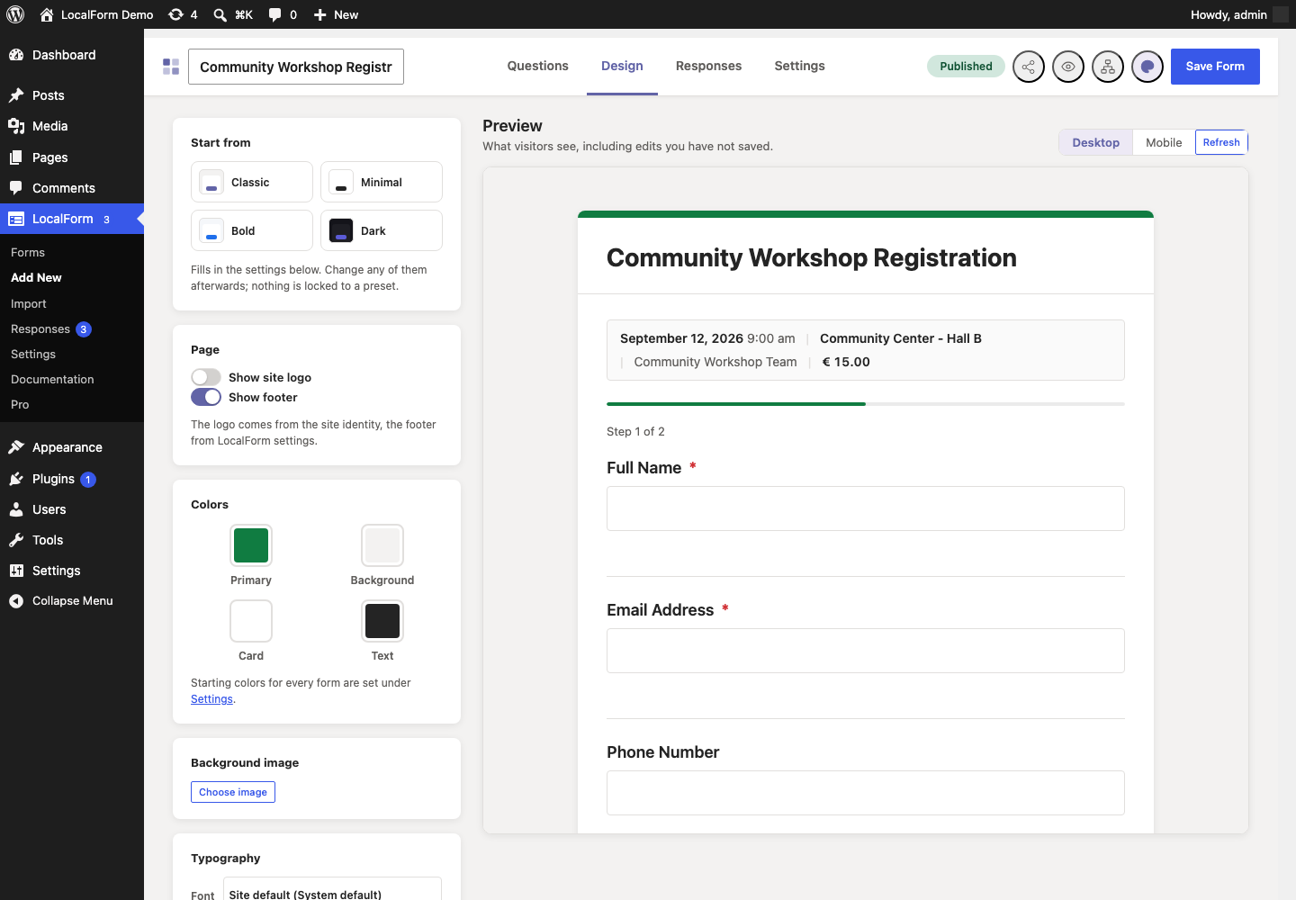
A preview of the form sits beside the controls, so a color is picked against the thing it changes. It shows the form as a visitor gets it, unsaved edits included. Colors, fonts and sizes appear in it as you pick them; Refresh rebuilds it after you have been editing questions on the other tab.
Cover photo and logo
Cover photo is a banner across the top of the form, above the title - the same place a header image sits on a Google form. Wide pictures work best; around 1600 by 400 pixels. A form with a cover drops the colored accent bar along the top of the card, because the picture is already there.
Show logo puts a logo above the form. It is your site's own logo by default - the one under Appearance → Customize → Site Identity - and Choose logo replaces it for this form only, which is what a registration page for one festival, one club or one client usually wants. Clear it again and the site logo comes back.
Design used to open as a small panel from the palette icon in the top bar. That icon is still there and now takes you to the tab.
The four colors decide more than four. Borders, the quieter shades used for helper text and hints, and the color a button turns under the cursor are all worked out from the card, text and primary you chose - so a form on a dark card keeps borders you can see and text you can read, and its buttons stop hovering to the stock purple. Nothing here needs setting; leaving a color alone leaves its companions alone too.
Start from a preset
Classic, Minimal, Bold and Dark fill in the settings below in one click. They are starting points, not modes: change anything afterwards and nothing snaps back, and a form does not remember which one it came from - what it looks like is simply what its settings say. Classic is the palette LocalForm ships with, so it doubles as the way back after trying the others.
Each preset has been checked for readable contrast, both for the body text on the card and for the submit button's label on its own color.
Shape
Corners rounds the form and everything in it together - square, rounded (the default) or soft. Shadow is how far the form lifts off the page: none, soft or strong. On a dark page, none is usually the right answer, because a shadow nobody can see is only a blur. Width is how wide the form is allowed to get: narrow, normal or wide.
Layout
Card is the default: the form sits on its own panel, with a background and a shadow. Plain drops the panel, which is usually what an embedded form wants - the page around it already has one, and two nested panels read as a mistake.
CSS class
Anything typed here is added to the form, so a theme's own stylesheet can target this one form. Separate several with spaces. Only letters, numbers, hyphens and underscores survive.
Setting the house style once
LocalForm → Settings → Appearance holds the same choices as defaults for every form: the starting colors, and a Default Form Style row for the font, size, corners, shadow, width and layout. Set them once and every form set to Site default follows - including when you change them later.
Each of those settings on a form's Design tab starts at Site default, which is a real choice rather than a copy: a form left on it keeps following this screen. Pick anything else and that form stops following, for that setting only.
The submit button's label
The button at the bottom of a form says Register unless you say otherwise.
Set it site-wide under LocalForm → Settings → General → Submit button label and every form follows it - "Sign up", "Book a place", "Send".
One form can say something else: put it in Submit button label in that form's General panel, and it wins over the site-wide one for that form only. The box shows the site-wide label as its placeholder, so you can see what the form would say if you left it empty - and leaving it empty is how a form goes back to following that setting, including when you change it later.
Light mode
Most forms never need a webhook. Light mode keeps their settings short: the Webhook URL, the Redirect URL and the Custom Fields card disappear from the form editor, leaving the settings a simple registration form actually uses.
Turn it on for one form with the Light mode switch in its General panel; the editor updates as you flip it, no save needed.
Set the default for forms that have not chosen under LocalForm → Settings → General → Light mode by default. A form follows that default until you flip its own switch, after which it keeps its own choice.
Hiding is not clearing: a form that already had a webhook URL, a redirect URL or custom fields keeps them, and they keep working. Switch light mode off to see them again. Global webhook fields (Pro) stay visible either way when there are any, since a form may still have to supply a value for them.
Choosing which features the form editor offers
Light mode shortens one form's settings. If a whole feature is never used on your site, you can take it out of the form editor entirely, for everyone.
Under LocalForm → Settings → General → Form Builder, Features available in the form editor lists what the editor can show:
| Feature | What it covers |
|---|---|
| Tags | The tag box in a form's General panel. |
| Event details | Date, time, location, organizer and price. |
| Access | Restricting who may fill in a form. |
| Registration limits | Closing a form, capping registrations, opening and closing on a schedule. |
| Spam protection | A single form overriding the site-wide spam settings. |
| Quiz | The answer key, points and pass mark. |
| Email notifications | Per-form control of the admin notification and the confirmation email. |
| Custom fields | Key-value pairs sent to the webhook but not shown on the form. |
Everything is ticked to begin with, so a site that never opens this setting sees the editor it has always seen. Untick what your colleagues do not need and those cards leave every form editor on the site — useful when the people building forms are not the people who set the site up, and a shorter editor is a faster one.
Two things worth knowing:
- Hiding is not clearing, exactly as with light mode. A form set up while a feature was on keeps everything it stored, and keeps working — a registration cap still applies, a quiz still marks, a confirmation email still goes out. Tick the feature again and its settings are there, untouched.
- Only the editor changes. Switching off Spam protection hides the per-form override; it does not weaken the site-wide protection under Settings → Security, which keeps running for every form.
This is a site-wide choice about which features exist here at all. Light mode is a per-form choice about hiding delivery details. They stack: a card shows when its feature is ticked here and light mode is not hiding it.
Tags
Add tags to a form in its General panel to organize and filter the Forms list (LocalForm → Forms) by tag.
Anti-spam
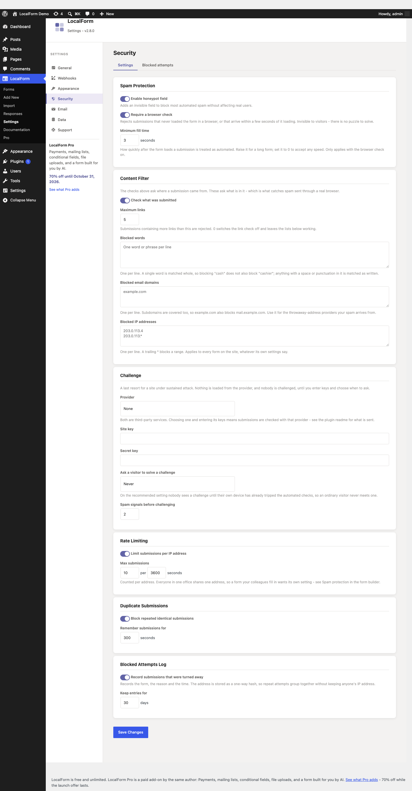
Under LocalForm → Settings → Security:
- Spam Protection - an invisible honeypot field and a browser check that blocks most automated spam without affecting real visitors, with a minimum fill time you can tune.
- Content Filter - a link limit, plus blocklists for words, email domains and IP addresses. This is what catches spam sent through a real browser.
- Challenge - optional Cloudflare Turnstile or hCaptcha, off by default, and best set to appear only after a visitor's own device has tripped the automated checks.
- Rate Limiting - cap submissions per IP address within a time window.
- Duplicate Submissions - block a repeated, identical submission for a configurable number of seconds. A blocked resubmission shows "This submission has already been received." instead of saving again.
- Blocked Attempts Log - what was turned away, from which form and why, so the settings above can be tuned from evidence. No IP addresses are stored.
Per-form spam settings
One set of numbers rarely fits every form. The builder's Spam Protection card has a switch - Give this form its own spam settings - that takes a form out of the site-wide settings and gives it its own honeypot, browser check, minimum fill time, rate limit, duplicate check, link limit and challenge mode.
Use it for the internal form a whole office fills in from one shared IP address, where the site-wide rate limit would lock out the tenth colleague to try - and for the one public form being hammered, where you want a challenge without imposing one on the rest of the site. Switching the override on starts from the site's current values; switching it off returns the form to following the site. The blocklists stay site-wide.
Full walkthrough: Cut down spam on your forms.
Review request
Once your site has collected 25 responses, LocalForm shows a single notice on the Forms and Responses screens asking whether you would write a review on WordPress.org. It appears nowhere else - never on the dashboard, never on another plugin's screen - and it has three answers: write one, Not now (quiet for three months), or Don't ask again (quiet for good). Each answer is remembered for the administrator who gave it.
To switch the asking off entirely, untick LocalForm → Settings → General →
Ask for a review on WordPress.org. That also removes the Rate LocalForm
link from the plugin's row under Plugins. Developers can do the same with
the localform_show_review_request filter.
Nothing is sent anywhere by any of this: LocalForm never checks whether you reviewed it, and the link simply opens WordPress.org in your browser.